ZeroPoint Block Library - Text and Image
Image and text component with customizable layout and background color.Text and Image Block Preview
Show / hide block preview
Text and Image Block Source Code
Show / hide source code
---
title: Text and Image
description: Image and text component with customizable layout and background color.
# Default values
heading: Text and image component
textContent: A component that combines text and an image.
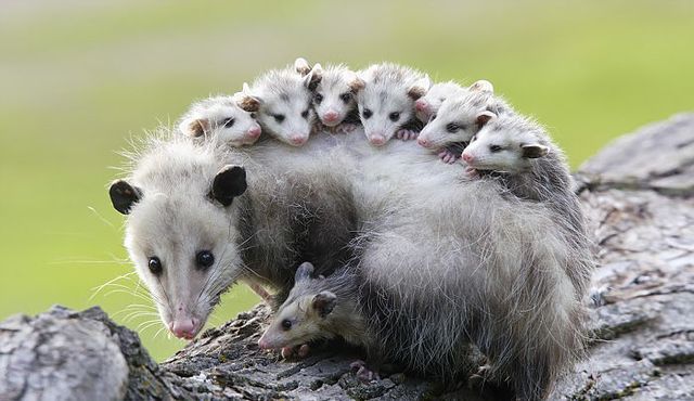
image: ./possums.jpg
imageAlt: A cute possum
imagePosition: right
background: primary
# CMS Fields
cms:
- name: heading
label: Heading
widget: string
- name: textContent
label: Text Content
widget: markdown
- name: image
label: Image
widget: image
- name: imageAlt
label: Image Alt Text
widget: string
- name: imagePosition
label: Image Position
widget: select
options:
- { label: "Left", value: "left" }
- { label: "Right", value: "right" }
- name: background
label: Background Color
widget: select
options:
- { label: "Light", value: "light" }
- { label: "Dark", value: "dark" }
- { label: "Primary", value: "primary" }
- { label: "Secondary", value: "secondary" }
---{# Optional component CSS #}
{% componentCss %}
.block-text-and-image {
background-color: var(--color-{{ background }});
color: var(--color-contrast-{{ background }});
padding: var(--unit);
border-radius: var(--border-radius);
figure {
img {
border-radius: var(--border-radius);
}
}
&.block-text-and-image-left {
figure {
order: -1;
}
}
.container {
display: flex;
flex-direction: column;
align-items: center;
gap: var(--unit);
}
@media (min-width: 992px) {
padding: calc(var(--unit) * 4 );
.container {
flex-direction: row;
align-items: flex-start;
gap: calc(var(--unit) * 2);
}
figure {
transform: rotate(6deg);
}
}
}
{% endcomponentCss %}
{# Component HTML, using the default values above #}
<section class="block block-{{ title | slugify }} block-{{ title | slugify }}-{{ imagePosition }}">
<div class="container">
<article>
{%- if heading -%}
<h2>{{ heading }}</h2>
{%- endif -%}
{%- if textContent -%}
{{- textContent | safe -}}
{%- endif -%}
</article>
{%- if image -%}
<figure>
<img src="{{ image }}" alt="{{ imageAlt }}" />
</figure>
{%- endif -%}
</div>
</section>Use Text and Image in your content
Show / hide usage example
{{-
  {
  "type": "text-and-image",
  "heading": "Text and image component",
  "textContent": "A component that combines text and an image.",
  "image": "./possums.jpg",
  "imageAlt": "A cute possum",
  "imagePosition": "right",
  "background": "primary",
  } | renderComponent | safe
-}}