ZeroPoint Block Library
A library of reusable HTML components (blocks) for ZeroPoint and zeropoint-components.
If you've added a CMS to your site, and set up automatic editor components, just copy and
paste the source code of any component into your src/assets/components directory to start using
them.
If you'd like to contribute a block to the library, make a pull request on the this website's repository!
Callout
A callout component to highlight important information.Callout Block Preview
Show / hide block preview
Callout Block Source Code
Show / hide source code
---
title: Callout
description: A callout component to highlight important information.

# Default values
heading: Build faster with ZeroPoint
textContent: A callout component to highlight important information.
links:
  - linkUrl: #
    linkText: Get Started with ZeroPoint!
  - linkUrl: #
    linkText: Learn more about ZeroPoint!
background: light

#CMS Fields
cms:
  - name: heading
    label: Heading
    widget: string
  - name: textContent
    label: Text Content
    widget: markdown
  - name: links
    label: Links
    widget: list
    listItemLabel: Link
    fields:
      - name: linkUrl
        label: Link URL
        widget: string
      - name: linkText
        label: Link Text
        widget: string
  - name: background
    label: Background Color
    widget: select
    options:
      - { label: "Light", value: "light" }
      - { label: "Dark", value: "dark" }
      - { label: "Primary", value: "primary" }
      - { label: "Secondary", value: "secondary" }
---
{# Optional component CSS #}
{%- componentCss -%}
.block-callout {
background-color: var(--color-{{ background }});
color: var(--color-contrast-{{ background }});
border: 1px solid var(--color-primary);
border-radius: var(--border-radius);
padding: var(--unit);
margin-bottom: var(--unit);
.buttons {
justify-content: center;
}
}
@media (min-width: 992px) {
.block-callout {
.buttons {
justify-content: flex-start;
}
}
}
{%- endcomponentCss -%}
<section class="block block-{{ title | slugify }}">
<article class="container">
<header>
<h2>{{ heading }}</h2>
</header>
{{- textContent | safe -}}
<footer>
<nav class="buttons">
{%- for link in links -%}
<a
href="{{ link.linkUrl }}"
class="button {{ 'button-primary' if loop.first else 'button-secondary' }}"
>
{{- link.linkText -}}
</a>
{%- endfor -%}
</nav>
</footer>
</article>
</section>Use Callout in your content
Show / hide usage example
{{-
  {
  "type": "callout",
  "heading": "Build faster with ZeroPoint",
  "textContent": "A callout component to highlight important information.",
        "links": [
            {
             "linkUrl": "",
             "linkText": "Get Started with ZeroPoint!"
            },
            {
             "linkUrl": "",
             "linkText": "Learn more about ZeroPoint!"
            }
        ],
  "background": "light",
  } | renderComponent | safe
-}}
FAQ
A list of frequently asked questions using native HTML details/summary — no JavaScript required.FAQ Block Preview
Show / hide block preview
Frequently Asked Questions
-
Do I need to know how to code to use ZeroPoint?
A basic understanding of HTML is helpful, but the block system lets you build pages visually if you pair ZeroPoint with a CMS like Netlify CMS or Decap.
-
Can I use a custom domain?
Yes. Netlify, Cloudflare Pages, and Vercel all support custom domains with free SSL certificates included.
-
Is ZeroPoint free to use?
ZeroPoint is open source and free to use. Hosting on Netlify or Cloudflare Pages is also free for most personal and small business sites.
-
How do I add a blog?
ZeroPoint includes a blog collection out of the box. Add Markdown or Nunjucks files to the `src/content/posts/` directory and they appear automatically.
FAQ Block Source Code
Show / hide source code
---
title: FAQ
description: A list of frequently asked questions using native HTML details/summary — no JavaScript required.

# Default values
heading: Frequently Asked Questions
items:
  - question: Do I need to know how to code to use ZeroPoint?
    answer: A basic understanding of HTML is helpful, but the block system lets you build pages visually if you pair ZeroPoint with a CMS like Netlify CMS or Decap.
  - question: Can I use a custom domain?
    answer: Yes. Netlify, Cloudflare Pages, and Vercel all support custom domains with free SSL certificates included.
  - question: Is ZeroPoint free to use?
    answer: ZeroPoint is open source and free to use. Hosting on Netlify or Cloudflare Pages is also free for most personal and small business sites.
  - question: How do I add a blog?
    answer: ZeroPoint includes a blog collection out of the box. Add Markdown or Nunjucks files to the `src/content/posts/` directory and they appear automatically.

# CMS Fields
cms:
  - name: heading
    label: Section Heading
    widget: string
  - name: items
    label: Questions
    widget: list
    listItemLabel: Question
    fields:
      - name: question
        label: Question
        widget: string
      - name: answer
        label: Answer
        widget: text
---
{%- componentCss -%}
.block-faq {
ul {
list-style: none;
}
details summary::after {
content: " (click to expand)";
}
details[open] summary::after {
content: " (click to collapse)";
}
}
{%- endcomponentCss -%}
<section class="block block-{{ title | slugify }}">
<div class="container">
{%- if heading -%}
<h2>{{ heading }}</h2>
{%- endif -%}
<ul class="faq-list">
{%- for item in items -%}
<li>
<details>
<summary>{{ item.question }}</summary>
<p class="faq-answer">{{ item.answer }}</p>
</details>
</li>
{%- endfor -%}
</ul>
</div>
</section>Use FAQ in your content
Show / hide usage example
{{-
  {
  "type": "faq",
  "heading": "Frequently Asked Questions",
        "items": [
            {
             "question": "Do I need to know how to code to use ZeroPoint?",
             "answer": "A basic understanding of HTML is helpful, but the block system lets you build pages visually if you pair ZeroPoint with a CMS like Netlify CMS or Decap."
            },
            {
             "question": "Can I use a custom domain?",
             "answer": "Yes. Netlify, Cloudflare Pages, and Vercel all support custom domains with free SSL certificates included."
            },
            {
             "question": "Is ZeroPoint free to use?",
             "answer": "ZeroPoint is open source and free to use. Hosting on Netlify or Cloudflare Pages is also free for most personal and small business sites."
            },
            {
             "question": "How do I add a blog?",
             "answer": "ZeroPoint includes a blog collection out of the box. Add Markdown or Nunjucks files to the `src/content/posts/` directory and they appear automatically."
            }
        ],
  } | renderComponent | safe
-}}
Feature Cards
A grid of cards, each with an icon, heading, and short description.Feature Cards Block Preview
Show / hide block preview
Why ZeroPoint?
-
Blazing Fast
Pre-rendered HTML means instant page loads. No JavaScript bundles slowing you down.
-
Easy to Customize
Familiar HTML, CSS, and Nunjucks templates. No framework lock-in, just the web platform.
-
Battle-Tested
Built on Eleventy, one of the most reliable and performant static site generators available.
-
Secure by Default
No server, no database, no attack surface. Static files served from a CDN.
Feature Cards Block Source Code
Show / hide source code
---
title: Feature Cards
description: A grid of cards, each with an icon, heading, and short description.

# Default values
heading: Why ZeroPoint?
cards:
  - icon: <svg xmlns="http://www.w3.org/2000/svg" viewBox="0 0 512 512"><path d="M256 0a256 256 0 1 1 0 512A256 256 0 1 1 256 0zM232 120l0 136c0 8 4 15.5 10.7 20l96 64c11 7.4 25.9 4.5 33.3-6.5s4.5-25.9-6.5-33.3L280 243.2 280 120c0-13.3-10.7-24-24-24s-24 10.7-24 24z"/></svg>
    heading: Blazing Fast
    description: Pre-rendered HTML means instant page loads. No JavaScript bundles slowing you down.
  - icon: <svg xmlns="http://www.w3.org/2000/svg" viewBox="0 0 512 512"><path d="M362.7 19.3L314.3 67.7 444.3 197.7l48.4-48.4c25-25 25-65.5 0-90.5L453.3 19.3c-25-25-65.5-25-90.5 0zm-71 71L58.6 323.5c-10.4 10.4-18 23.3-22.2 37.4L1 481.2C-1.5 489.7 .8 498.8 7 505s15.3 8.5 23.7 6.1l120.3-35.4c14.1-4.2 27-11.8 37.4-22.2L421.7 220.3 291.7 90.3z"/></svg>
    heading: Easy to Customize
    description: Familiar HTML, CSS, and Nunjucks templates. No framework lock-in, just the web platform.
  - icon: <svg xmlns="http://www.w3.org/2000/svg" viewBox="0 0 576 512"><path d="M316.9 18C311.6 7 300.4 0 288.1 0s-23.4 7-28.8 18L195 150.3 51.4 171.5c-12 1.8-22 10.2-25.7 21.7s-.7 24.2 7.9 32.7L137.8 329 113.2 474.7c-2 12 3 24.2 12.9 31.3s23 8 33.8 2.3l128.3-68.5 128.3 68.5c10.8 5.7 23.9 4.9 33.8-2.3s14.9-19.3 12.9-31.3L438.5 329 542.7 225.9c8.6-8.5 11.7-21.2 7.9-32.7s-13.7-19.9-25.7-21.7L381.2 150.3 316.9 18z"/></svg>
    heading: Battle-Tested
    description: Built on Eleventy, one of the most reliable and performant static site generators available.
  - icon: <svg xmlns="http://www.w3.org/2000/svg" viewBox="0 0 448 512"><path d="M144 144l0-32c0-44.2 35.8-80 80-80s80 35.8 80 80l0 32-160 0zm-48 0l0-32C96 50.1 146.1 0 208 0l32 0c61.9 0 112 50.1 112 112l0 32 48 0c8.8 0 16 7.2 16 16l0 304c0 26.5-21.5 48-48 48L80 512c-26.5 0-48-21.5-48-48L32 160c0-8.8 7.2-16 16-16l48 0zm28 168a28 28 0 1 0 0-56 28 28 0 1 0 0 56z"/></svg>
    heading: Secure by Default
    description: No server, no database, no attack surface. Static files served from a CDN.
background: light
columns: 4

# CMS Fields
cms:
  - name: heading
    label: Section Heading
    widget: string
  - name: cards
    label: Cards
    widget: list
    listItemLabel: Card
    fields:
      - name: icon
        label: Icon (SVG)
        widget: text
      - name: heading
        label: Card Heading
        widget: string
      - name: description
        label: Description
        widget: text
  - name: background
    label: Background Color
    widget: select
    options:
      - { label: "Light", value: "light" }
      - { label: "Dark", value: "dark" }
      - { label: "Primary", value: "primary" }
      - { label: "Secondary", value: "secondary" }
  - name: columns
    label: Columns
    widget: select
    options:
      - { label: "2", value: 2 }
      - { label: "3", value: 3 }
      - { label: "4", value: 4 }
---
{%- componentCss -%}
.block-feature-cards {
background-color: var(--color-{{ background }});
color: var(--color-contrast-{{ background }});
padding: var(--unit);
.feature-cards-grid {
list-style: none;
padding: var(--unit);
display: grid;
gap: calc(var(--unit) * 1.5);
grid-template-columns: 1fr;
@media (min-width: 992px) {
grid-template-columns: repeat({{ columns }}, 1fr);
}
}
.feature-card {
padding: var(--unit);
border-radius: var(--border-radius);
border: 1px solid var(--color-primary);
svg {
width: 2rem;
height: 2rem;
fill: var(--color-primary);
}
}
}
{%- endcomponentCss -%}
<section class="block block-{{ title | slugify }}">
<div class="container">
{%- if heading -%}
<h2>{{ heading }}</h2>
{%- endif -%}
<ul class="feature-cards-grid">
{%- for card in cards -%}
<li class="feature-card">
{%- if card.icon -%}{{ card.icon | safe }}{%- endif -%}
<h3>{{ card.heading }}</h3>
<p>{{ card.description }}</p>
</li>
{%- endfor -%}
</ul>
</div>
</section>Use Feature Cards in your content
Show / hide usage example
{{-
  {
  "type": "feature-cards",
  "heading": "Why ZeroPoint?",
        "cards": [
            {
             "icon": "<svg xmlns="http://www.w3.org/2000/svg" viewBox="0 0 512 512"><path d="M256 0a256 256 0 1 1 0 512A256 256 0 1 1 256 0zM232 120l0 136c0 8 4 15.5 10.7 20l96 64c11 7.4 25.9 4.5 33.3-6.5s4.5-25.9-6.5-33.3L280 243.2 280 120c0-13.3-10.7-24-24-24s-24 10.7-24 24z"/></svg>",
             "heading": "Blazing Fast",
             "description": "Pre-rendered HTML means instant page loads. No JavaScript bundles slowing you down."
            },
            {
             "icon": "<svg xmlns="http://www.w3.org/2000/svg" viewBox="0 0 512 512"><path d="M362.7 19.3L314.3 67.7 444.3 197.7l48.4-48.4c25-25 25-65.5 0-90.5L453.3 19.3c-25-25-65.5-25-90.5 0zm-71 71L58.6 323.5c-10.4 10.4-18 23.3-22.2 37.4L1 481.2C-1.5 489.7 .8 498.8 7 505s15.3 8.5 23.7 6.1l120.3-35.4c14.1-4.2 27-11.8 37.4-22.2L421.7 220.3 291.7 90.3z"/></svg>",
             "heading": "Easy to Customize",
             "description": "Familiar HTML, CSS, and Nunjucks templates. No framework lock-in, just the web platform."
            },
            {
             "icon": "<svg xmlns="http://www.w3.org/2000/svg" viewBox="0 0 576 512"><path d="M316.9 18C311.6 7 300.4 0 288.1 0s-23.4 7-28.8 18L195 150.3 51.4 171.5c-12 1.8-22 10.2-25.7 21.7s-.7 24.2 7.9 32.7L137.8 329 113.2 474.7c-2 12 3 24.2 12.9 31.3s23 8 33.8 2.3l128.3-68.5 128.3 68.5c10.8 5.7 23.9 4.9 33.8-2.3s14.9-19.3 12.9-31.3L438.5 329 542.7 225.9c8.6-8.5 11.7-21.2 7.9-32.7s-13.7-19.9-25.7-21.7L381.2 150.3 316.9 18z"/></svg>",
             "heading": "Battle-Tested",
             "description": "Built on Eleventy, one of the most reliable and performant static site generators available."
            },
            {
             "icon": "<svg xmlns="http://www.w3.org/2000/svg" viewBox="0 0 448 512"><path d="M144 144l0-32c0-44.2 35.8-80 80-80s80 35.8 80 80l0 32-160 0zm-48 0l0-32C96 50.1 146.1 0 208 0l32 0c61.9 0 112 50.1 112 112l0 32 48 0c8.8 0 16 7.2 16 16l0 304c0 26.5-21.5 48-48 48L80 512c-26.5 0-48-21.5-48-48L32 160c0-8.8 7.2-16 16-16l48 0zm28 168a28 28 0 1 0 0-56 28 28 0 1 0 0 56z"/></svg>",
             "heading": "Secure by Default",
             "description": "No server, no database, no attack surface. Static files served from a CDN."
            }
        ],
  "background": "light",
  "columns": "4",
  } | renderComponent | safe
-}}
Icon Group
A group of icons with optional labels.Icon Group Block Preview
Show / hide block preview
Icon Group Block Source Code
Show / hide source code
---
# Required fields
title: Icon Group
description: A group of icons with optional labels.

# Default values
icons:
  - icon: <svg xmlns="http://www.w3.org/2000/svg" viewBox="0 0 576 512"><!--!Font Awesome Free v7.0.1 by @fontawesome - https://fontawesome.com License - https://fontawesome.com/license/free Copyright 2025 Fonticons, Inc.--><path d="M192 96c0-53 43-96 96-96s96 43 96 96l0 3.6c0 15.7-12.7 28.4-28.4 28.4l-135.1 0c-15.7 0-28.4-12.7-28.4-28.4l0-3.6zm345.6 12.8c10.6 14.1 7.7 34.2-6.4 44.8l-97.8 73.3c5.3 8.9 9.3 18.7 11.8 29.1l98.8 0c17.7 0 32 14.3 32 32s-14.3 32-32 32l-96 0 0 32c0 2.6-.1 5.3-.2 7.9l83.4 62.5c14.1 10.6 17 30.7 6.4 44.8s-30.7 17-44.8 6.4l-63.1-47.3c-23.2 44.2-66.5 76.2-117.7 83.9L312 280c0-13.3-10.7-24-24-24s-24 10.7-24 24l0 230.2c-51.2-7.7-94.5-39.7-117.7-83.9L83.2 473.6c-14.1 10.6-34.2 7.7-44.8-6.4s-7.7-34.2 6.4-44.8l83.4-62.5c-.1-2.6-.2-5.2-.2-7.9l0-32-96 0c-17.7 0-32-14.3-32-32s14.3-32 32-32l98.8 0c2.5-10.4 6.5-20.2 11.8-29.1L44.8 153.6c-14.1-10.6-17-30.7-6.4-44.8s30.7-17 44.8-6.4L192 184c12.3-5.1 25.8-8 40-8l112 0c14.2 0 27.7 2.8 40 8l108.8-81.6c14.1-10.6 34.2-7.7 44.8 6.4z"/></svg>
    label: Bug Icon
    link: "#"
  - icon: <svg xmlns="http://www.w3.org/2000/svg" viewBox="0 0 640 512"><!--!Font Awesome Free v7.0.1 by @fontawesome - https://fontawesome.com License - https://fontawesome.com/license/free Copyright 2025 Fonticons, Inc.--><path d="M407 47c9.4-9.4 24.6-9.4 33.9 0l17.2 17.2c1.9-.1 3.9-.2 5.8-.2l32 0c11.2 0 21.9 2.3 31.6 6.5L543 55c9.4-9.4 24.6-9.4 33.9 0s9.4 24.6 0 33.9L564 101.9c7.6 12.2 12 26.7 12 42.1 0 10.2 7.4 18.8 16.7 23 27.9 12.5 47.3 40.5 47.3 73 0 26.2-12.6 49.4-32 64l0 32c0 8.8-7.2 16-16 16l-32 0c-8.8 0-16-7.2-16-16l0-16-64 0 0 16c0 8.8-7.2 16-16 16l-32 0c-8.8 0-16-7.2-16-16l0-17.6c-11.8-2.4-22.7-7.4-32-14.4-1.5-1.1-2.9-2.3-4.3-3.5-17-14.7-27.7-36.4-27.7-60.5 0-8.8-7.2-16-16-16s-16 7.2-16 16c0 44.7 26.2 83.2 64 101.2l0 10.8c0 17.7 14.3 32 32 32l32 0 0 64c0 17.7-14.3 32-32 32l-64 0c-17.7 0-32-14.3-32-32l0-76c-19.8 7.7-41.4 12-64 12s-44.2-4.3-64-12l0 76c0 17.7-14.3 32-32 32l-64 0c-17.7 0-32-14.3-32-32l0-118.9-18.1 40.7c-5.4 12.1-19.6 17.6-31.7 12.2S-3.3 362.4 2.1 350.3L24 300.9c5.3-11.9 8-24.7 8-37.7 0-107.5 85.2-195.2 191.8-199.1l.2-.1 64 0c41.7 0 83.4 12.1 117.2 25.7 1.7-1.8 3.5-3.6 5.3-5.2L407 81c-9.4-9.4-9.4-24.6 0-33.9zm73 185a24 24 0 1 0 -48 0 24 24 0 1 0 48 0zm88 24a24 24 0 1 0 0-48 24 24 0 1 0 0 48zM480 144a16 16 0 1 0 -32 0 16 16 0 1 0 32 0zm48 16a16 16 0 1 0 0-32 16 16 0 1 0 0 32z"/></svg>
    label: Hippo Icon
    link: "#"
  - icon: <svg xmlns="http://www.w3.org/2000/svg" viewBox="0 0 640 512"><!--!Font Awesome Free v7.0.1 by @fontawesome - https://fontawesome.com License - https://fontawesome.com/license/free Copyright 2025 Fonticons, Inc.--><path d="M181.5 197.1l12.9 6.4c5.9 3 12.4 4.5 19.1 4.5 23.5 0 42.6-19.1 42.6-42.6l0-21.4c0-35.3-28.7-64-64-64l-64 0c-35.3 0-64 28.7-64 64l0 21.4c0 23.5 19.1 42.6 42.6 42.6 6.6 0 13.1-1.5 19.1-4.5 9.3-4.7 16.4-8.2 21.2-10.6L135.1 185c-4.5-3-7.1-8-7.1-13.3l0-3.7c0-13.3 10.7-24 24-24l16 0c13.3 0 24 10.7 24 24l0 3.7c0 5.3-2.7 10.3-7.1 13.3l-11.8 7.9 8.4 4.2zm-8.6 49.4l-12.9-6.4-12.9 6.4c-12.6 6.3-26.5 9.6-40.5 9.6-3.6 0-7.1-.2-10.6-.6l0 .6c0 35.3 28.7 64 64 64l64 0c17.7 0 32 14.3 32 32s-14.3 32-32 32l160 0 0-64c0-23.7 12.9-44.4 32-55.4 9.4-5.4 20.3-8.6 32-8.6l0-16c0-26.5 21.5-48 48-48 8.8 0 16 7.2 16 16l0 96c0 8.8 7.2 16 16 16s16-7.2 16-16l0-99.7c0-48.2-30.8-91-76.6-106.3l-8.5-2.8c-8-2.7-12.6-11.1-10.4-19.3s10.3-13.2 18.6-11.6l19.9 4C576 86.1 640 164.2 640 254.9l0 1.1 0 0c0 123.7-100.3 224-224 224l-160.6 0C132 480 32 380 32 256.6l0-39.8c-10.1-14.6-16-32.3-16-51.4l0-21.4 0-1.4C6.7 139.3 0 130.5 0 120 0 106.7 10.7 96 24 96l2.8 0C44.8 58.2 83.3 32 128 32l64 0c44.7 0 83.2 26.2 101.2 64l2.8 0c13.3 0 24 10.7 24 24 0 10.5-6.7 19.3-16 22.6l0 1.4 0 21.4c0 1.4 0 2.8-.1 4.3 12-6.2 25.7-9.6 40.1-9.6l8 0c17.7 0 32 14.3 32 32s-14.3 32-32 32l-8 0c-13.3 0-24 10.7-24 24l0 8 56.4 0c-15.2 17-24.4 39.4-24.4 64l-32 0c-42.3 0-78.2-27.4-91-65.3-5.1 .9-10.3 1.3-15.6 1.3-14.1 0-27.9-3.3-40.5-9.6zM96 128a16 16 0 1 1 0 32 16 16 0 1 1 0-32zm112 16a16 16 0 1 1 32 0 16 16 0 1 1 -32 0z"/></svg>
    label: Otter Icon
    link: "#"
  - icon: <svg xmlns="http://www.w3.org/2000/svg" viewBox="0 0 576 512"><!--!Font Awesome Free v7.0.1 by @fontawesome - https://fontawesome.com License - https://fontawesome.com/license/free Copyright 2025 Fonticons, Inc.--><path d="M32 112c16.6 0 30.2 12.6 31.8 28.7l.3 6.6C65.8 163.4 79.4 176 96 176l179.1 0 140.9 60.4 0 243.6c0 17.7-14.3 32-32 32l-32 0c-17.7 0-32-14.3-32-32l0-131.3C296 361 268.8 368 240 368s-56-7-80-19.3L160 480c0 17.7-14.3 32-32 32l-32 0c-17.7 0-32-14.3-32-32l0-245.6c-37.3-13.2-64-48.6-64-90.4 0-17.7 14.3-32 32-32zM355.8-32c7.7 0 14.9 3.6 19.6 9.8L392 0 444.1 0c12.7 0 24.9 5.1 33.9 14.1L496 32 552 32c13.3 0 24 10.7 24 24l0 24c0 44.2-35.8 80-80 80l-64 0-7 28-124.7-53.4 31.6-147.2C334.3-23.9 344.2-32 355.8-32zM448 44a20 20 0 1 0 0 40 20 20 0 1 0 0-40z"/></svg>
    label: Dog Icon
    link: "#"

# CMS fields
cms:
  - name: icons
    label: Icons
    widget: list
    listItemLabel: Icon
    fields:
      - name: icon
        label: Icon (SVG or FontAwesome name)
        widget: string
      - name: label
        label: Label
        widget: string
      - name: link
        label: Link
        widget: string
---
{# Optional component CSS #}
{%- componentCss -%}
.block-icon-group ul.icon-group {
list-style: none;
display: flex;
flex-wrap: wrap;
gap: var(--unit);
align-items: center;
text-align: center;
li {
position: relative;
}
a {
&::after {
content: "";
position: absolute;
top: 0;
left: 0;
width: 100%;
height: 100%;
z-index: 1;
}
}
svg {
max-width: calc(var(--unit) * 3);
height: auto;
}
}
{%- endcomponentCss -%}
{# Component HTML, using the default values above #}
<section class="block block-{{ title | slugify }}">
<div class="container">
{%- if icons and icons | length > 0 -%}
<ul class="icon-group">
{%- for item in icons -%}
<li>
<figure>
{%- if item.icon -%}
{{- item.icon | safe -}}
{%- endif -%}
</figure>
<a href="{{ item.link }}" class="icon-item" aria-label="{{ item.label }}">
<span class="icon-label">{{ item.label }}</span>
</a>
</li>
{%- endfor -%}
</ul>
{%- endif -%}
</div>
</section>Use Icon Group in your content
Show / hide usage example
{{-
  {
  "type": "icon-group",
        "icons": [
            {
             "icon": "<svg xmlns="http://www.w3.org/2000/svg" viewBox="0 0 576 512"><!--!Font Awesome Free v7.0.1 by @fontawesome - https://fontawesome.com License - https://fontawesome.com/license/free Copyright 2025 Fonticons, Inc.--><path d="M192 96c0-53 43-96 96-96s96 43 96 96l0 3.6c0 15.7-12.7 28.4-28.4 28.4l-135.1 0c-15.7 0-28.4-12.7-28.4-28.4l0-3.6zm345.6 12.8c10.6 14.1 7.7 34.2-6.4 44.8l-97.8 73.3c5.3 8.9 9.3 18.7 11.8 29.1l98.8 0c17.7 0 32 14.3 32 32s-14.3 32-32 32l-96 0 0 32c0 2.6-.1 5.3-.2 7.9l83.4 62.5c14.1 10.6 17 30.7 6.4 44.8s-30.7 17-44.8 6.4l-63.1-47.3c-23.2 44.2-66.5 76.2-117.7 83.9L312 280c0-13.3-10.7-24-24-24s-24 10.7-24 24l0 230.2c-51.2-7.7-94.5-39.7-117.7-83.9L83.2 473.6c-14.1 10.6-34.2 7.7-44.8-6.4s-7.7-34.2 6.4-44.8l83.4-62.5c-.1-2.6-.2-5.2-.2-7.9l0-32-96 0c-17.7 0-32-14.3-32-32s14.3-32 32-32l98.8 0c2.5-10.4 6.5-20.2 11.8-29.1L44.8 153.6c-14.1-10.6-17-30.7-6.4-44.8s30.7-17 44.8-6.4L192 184c12.3-5.1 25.8-8 40-8l112 0c14.2 0 27.7 2.8 40 8l108.8-81.6c14.1-10.6 34.2-7.7 44.8 6.4z"/></svg>",
             "label": "Bug Icon",
             "link": "#"
            },
            {
             "icon": "<svg xmlns="http://www.w3.org/2000/svg" viewBox="0 0 640 512"><!--!Font Awesome Free v7.0.1 by @fontawesome - https://fontawesome.com License - https://fontawesome.com/license/free Copyright 2025 Fonticons, Inc.--><path d="M407 47c9.4-9.4 24.6-9.4 33.9 0l17.2 17.2c1.9-.1 3.9-.2 5.8-.2l32 0c11.2 0 21.9 2.3 31.6 6.5L543 55c9.4-9.4 24.6-9.4 33.9 0s9.4 24.6 0 33.9L564 101.9c7.6 12.2 12 26.7 12 42.1 0 10.2 7.4 18.8 16.7 23 27.9 12.5 47.3 40.5 47.3 73 0 26.2-12.6 49.4-32 64l0 32c0 8.8-7.2 16-16 16l-32 0c-8.8 0-16-7.2-16-16l0-16-64 0 0 16c0 8.8-7.2 16-16 16l-32 0c-8.8 0-16-7.2-16-16l0-17.6c-11.8-2.4-22.7-7.4-32-14.4-1.5-1.1-2.9-2.3-4.3-3.5-17-14.7-27.7-36.4-27.7-60.5 0-8.8-7.2-16-16-16s-16 7.2-16 16c0 44.7 26.2 83.2 64 101.2l0 10.8c0 17.7 14.3 32 32 32l32 0 0 64c0 17.7-14.3 32-32 32l-64 0c-17.7 0-32-14.3-32-32l0-76c-19.8 7.7-41.4 12-64 12s-44.2-4.3-64-12l0 76c0 17.7-14.3 32-32 32l-64 0c-17.7 0-32-14.3-32-32l0-118.9-18.1 40.7c-5.4 12.1-19.6 17.6-31.7 12.2S-3.3 362.4 2.1 350.3L24 300.9c5.3-11.9 8-24.7 8-37.7 0-107.5 85.2-195.2 191.8-199.1l.2-.1 64 0c41.7 0 83.4 12.1 117.2 25.7 1.7-1.8 3.5-3.6 5.3-5.2L407 81c-9.4-9.4-9.4-24.6 0-33.9zm73 185a24 24 0 1 0 -48 0 24 24 0 1 0 48 0zm88 24a24 24 0 1 0 0-48 24 24 0 1 0 0 48zM480 144a16 16 0 1 0 -32 0 16 16 0 1 0 32 0zm48 16a16 16 0 1 0 0-32 16 16 0 1 0 0 32z"/></svg>",
             "label": "Hippo Icon",
             "link": "#"
            },
            {
             "icon": "<svg xmlns="http://www.w3.org/2000/svg" viewBox="0 0 640 512"><!--!Font Awesome Free v7.0.1 by @fontawesome - https://fontawesome.com License - https://fontawesome.com/license/free Copyright 2025 Fonticons, Inc.--><path d="M181.5 197.1l12.9 6.4c5.9 3 12.4 4.5 19.1 4.5 23.5 0 42.6-19.1 42.6-42.6l0-21.4c0-35.3-28.7-64-64-64l-64 0c-35.3 0-64 28.7-64 64l0 21.4c0 23.5 19.1 42.6 42.6 42.6 6.6 0 13.1-1.5 19.1-4.5 9.3-4.7 16.4-8.2 21.2-10.6L135.1 185c-4.5-3-7.1-8-7.1-13.3l0-3.7c0-13.3 10.7-24 24-24l16 0c13.3 0 24 10.7 24 24l0 3.7c0 5.3-2.7 10.3-7.1 13.3l-11.8 7.9 8.4 4.2zm-8.6 49.4l-12.9-6.4-12.9 6.4c-12.6 6.3-26.5 9.6-40.5 9.6-3.6 0-7.1-.2-10.6-.6l0 .6c0 35.3 28.7 64 64 64l64 0c17.7 0 32 14.3 32 32s-14.3 32-32 32l160 0 0-64c0-23.7 12.9-44.4 32-55.4 9.4-5.4 20.3-8.6 32-8.6l0-16c0-26.5 21.5-48 48-48 8.8 0 16 7.2 16 16l0 96c0 8.8 7.2 16 16 16s16-7.2 16-16l0-99.7c0-48.2-30.8-91-76.6-106.3l-8.5-2.8c-8-2.7-12.6-11.1-10.4-19.3s10.3-13.2 18.6-11.6l19.9 4C576 86.1 640 164.2 640 254.9l0 1.1 0 0c0 123.7-100.3 224-224 224l-160.6 0C132 480 32 380 32 256.6l0-39.8c-10.1-14.6-16-32.3-16-51.4l0-21.4 0-1.4C6.7 139.3 0 130.5 0 120 0 106.7 10.7 96 24 96l2.8 0C44.8 58.2 83.3 32 128 32l64 0c44.7 0 83.2 26.2 101.2 64l2.8 0c13.3 0 24 10.7 24 24 0 10.5-6.7 19.3-16 22.6l0 1.4 0 21.4c0 1.4 0 2.8-.1 4.3 12-6.2 25.7-9.6 40.1-9.6l8 0c17.7 0 32 14.3 32 32s-14.3 32-32 32l-8 0c-13.3 0-24 10.7-24 24l0 8 56.4 0c-15.2 17-24.4 39.4-24.4 64l-32 0c-42.3 0-78.2-27.4-91-65.3-5.1 .9-10.3 1.3-15.6 1.3-14.1 0-27.9-3.3-40.5-9.6zM96 128a16 16 0 1 1 0 32 16 16 0 1 1 0-32zm112 16a16 16 0 1 1 32 0 16 16 0 1 1 -32 0z"/></svg>",
             "label": "Otter Icon",
             "link": "#"
            },
            {
             "icon": "<svg xmlns="http://www.w3.org/2000/svg" viewBox="0 0 576 512"><!--!Font Awesome Free v7.0.1 by @fontawesome - https://fontawesome.com License - https://fontawesome.com/license/free Copyright 2025 Fonticons, Inc.--><path d="M32 112c16.6 0 30.2 12.6 31.8 28.7l.3 6.6C65.8 163.4 79.4 176 96 176l179.1 0 140.9 60.4 0 243.6c0 17.7-14.3 32-32 32l-32 0c-17.7 0-32-14.3-32-32l0-131.3C296 361 268.8 368 240 368s-56-7-80-19.3L160 480c0 17.7-14.3 32-32 32l-32 0c-17.7 0-32-14.3-32-32l0-245.6c-37.3-13.2-64-48.6-64-90.4 0-17.7 14.3-32 32-32zM355.8-32c7.7 0 14.9 3.6 19.6 9.8L392 0 444.1 0c12.7 0 24.9 5.1 33.9 14.1L496 32 552 32c13.3 0 24 10.7 24 24l0 24c0 44.2-35.8 80-80 80l-64 0-7 28-124.7-53.4 31.6-147.2C334.3-23.9 344.2-32 355.8-32zM448 44a20 20 0 1 0 0 40 20 20 0 1 0 0-40z"/></svg>",
             "label": "Dog Icon",
             "link": "#"
            }
        ],
  } | renderComponent | safe
-}}
Link Group
A group of links, typically used for navigation or related resources.Link Group Block Preview
Show / hide block preview
Link Group Block Source Code
Show / hide source code
---
# Required fields
title: Link Group
description: A group of links, typically used for navigation or related resources.

# Default values
links:
  - link: "#"
    linkText: Lorem Ipsum
  - link: "#"
    linkText: Dolor Sit Amet
  - link: "#"
    linkText: Consectetur

# CMS Fields
cms:
  - name: links
    label: Links
    widget: list
    listItemLabel: Link
    fields:
      - name: link
        label: Link URL
        widget: string
      - name: linkText
        label: Link Text
        widget: string
---
{# Optional component CSS #}
{%- componentCss -%}
.block-link-group nav {
display: flex;
flex-direction: column;
justify-content: flex-start;
gap: var(--unit);
flex-wrap: wrap;
}
@media (min-width: 992px) {
.block-link-group nav {
flex-direction: row;
}
}
{%- endcomponentCss -%}
{# Component HTML, using the default values above #}
<section class="block block-{{ title | slugify }}">
<div class="container">
<nav>
{%- for link in links -%}
<a href="{{ link.link }}">{{ link.linkText }}</a>
{%- endfor -%}
</nav>
</div>
</section>Use Link Group in your content
Show / hide usage example
{{-
  {
  "type": "link-group",
        "links": [
            {
             "link": "#",
             "linkText": "Lorem Ipsum"
            },
            {
             "link": "#",
             "linkText": "Dolor Sit Amet"
            },
            {
             "link": "#",
             "linkText": "Consectetur"
            }
        ],
  } | renderComponent | safe
-}}
Text
A block of rich text content.Text Block Preview
Show / hide block preview
Lorem ipsum dolor sit amet.
Text Block Source Code
Show / hide source code
---
# Required fields
title: Text
description: A block of rich text content.

# Default values
textContent: >-
  Lorem ipsum dolor sit _amet_.

# CMS Fields
cms:
  - name: textContent
    label: Body
    widget: markdown
---
{# Component HTML, using the default values above #}
<section class="block block-{{ title | slugify }}">
<article class="container">
{{- textContent | markdown | safe -}}
</article>
</section>Use Text in your content
Show / hide usage example
{{-
  {
  "type": "text",
  "textContent": "Lorem ipsum dolor sit _amet_.",
  } | renderComponent | safe
-}}
Text and Image
Image and text component with customizable layout and background color.Text and Image Block Preview
Show / hide block preview
Text and image component
A component that combines text and an image.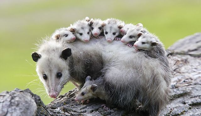
Text and Image Block Source Code
Show / hide source code
---
title: Text and Image
description: Image and text component with customizable layout and background color.

# Default values
heading: Text and image component
textContent: A component that combines text and an image.
image: ./possums.jpg
imageAlt: A cute possum
imagePosition: right
background: primary

# CMS Fields
cms:
  - name: heading
    label: Heading
    widget: string
  - name: textContent
    label: Text Content
    widget: markdown
  - name: image
    label: Image
    widget: image
  - name: imageAlt
    label: Image Alt Text
    widget: string
  - name: imagePosition
    label: Image Position
    widget: select
    options:
      - { label: "Left", value: "left" }
      - { label: "Right", value: "right" }
  - name: background
    label: Background Color
    widget: select
    options:
      - { label: "Light", value: "light" }
      - { label: "Dark", value: "dark" }
      - { label: "Primary", value: "primary" }
      - { label: "Secondary", value: "secondary" }
---
{# Optional component CSS #}
{% componentCss %}
.block-text-and-image {
background-color: var(--color-{{ background }});
color: var(--color-contrast-{{ background }});
padding: var(--unit);
border-radius: var(--border-radius);
figure {
img {
border-radius: var(--border-radius);
}
}
&.block-text-and-image-left {
figure {
order: -1;
}
}
.container {
display: flex;
flex-direction: column;
align-items: center;
gap: var(--unit);
}
@media (min-width: 992px) {
padding: calc(var(--unit) * 4 );
.container {
flex-direction: row;
align-items: flex-start;
gap: calc(var(--unit) * 2);
}
figure {
transform: rotate(6deg);
}
}
}
{% endcomponentCss %}
{# Component HTML, using the default values above #}
<section class="block block-{{ title | slugify }} block-{{ title | slugify }}-{{ imagePosition }}">
<div class="container">
<article>
{%- if heading -%}
<h2>{{ heading }}</h2>
{%- endif -%}
{%- if textContent -%}
{{- textContent | safe -}}
{%- endif -%}
</article>
{%- if image -%}
<figure>
<img src="{{ image }}" alt="{{ imageAlt }}" />
</figure>
{%- endif -%}
</div>
</section>Use Text and Image in your content
Show / hide usage example
{{-
  {
  "type": "text-and-image",
  "heading": "Text and image component",
  "textContent": "A component that combines text and an image.",
  "image": "./possums.jpg",
  "imageAlt": "A cute possum",
  "imagePosition": "right",
  "background": "primary",
  } | renderComponent | safe
-}}
Video Embed
A responsive video embed for YouTube or Vimeo with a maintained aspect ratio.Video Embed Block Preview
Show / hide block preview
Video Embed Block Source Code
Show / hide source code
---
title: Video Embed
description: A responsive video embed for YouTube or Vimeo with a maintained aspect ratio.

# Default values
videoUrl: https://www.youtube.com/watch?v=NpEaa2P7qZI
caption: "A placeholder video."

# CMS Fields
cms:
  - name: videoUrl
    label: Video URL (YouTube or Vimeo)
    widget: string
  - name: caption
    label: Caption (optional)
    widget: string
    required: false
---
{#
Convert a YouTube or Vimeo watch URL to its embed URL.
YouTube: https://www.youtube.com/watch?v=ID → https://www.youtube.com/embed/ID
Vimeo: https://vimeo.com/ID → https://player.vimeo.com/video/ID
#}
{%- set embedUrl = videoUrl -%}
{%- if "youtube.com/watch" in videoUrl -%}
{%- set videoId = videoUrl | replace("https://www.youtube.com/watch?v=", "") | replace("https://youtube.com/watch?v=", "") -%}
{%- set embedUrl = "https://www.youtube.com/embed/" + videoId -%}
{%- elif "youtu.be/" in videoUrl -%}
{%- set videoId = videoUrl | replace("https://youtu.be/", "") -%}
{%- set embedUrl = "https://www.youtube.com/embed/" + videoId -%}
{%- elif "vimeo.com/" in videoUrl and "player.vimeo.com" not in videoUrl -%}
{%- set videoId = videoUrl | replace("https://vimeo.com/", "") -%}
{%- set embedUrl = "https://player.vimeo.com/video/" + videoId -%}
{%- endif -%}
<section class="block block-{{ title | slugify }}">
<div class="container">
<figure>
<div class="video-wrapper">
<iframe
src="{{ embedUrl }}"
title="Video embed"
allow="accelerometer; autoplay; clipboard-write; encrypted-media; gyroscope; picture-in-picture"
allowfullscreen
></iframe>
</div>
{%- if caption -%}
<figcaption>{{ caption }}</figcaption>
{%- endif -%}
</figure>
</div>
</section>Use Video Embed in your content
Show / hide usage example
{{-
  {
  "type": "video-embed",
  "videoUrl": "https://www.youtube.com/watch?v=NpEaa2P7qZI",
  "caption": "A placeholder video.",
  } | renderComponent | safe
-}}